How to Paint a Sky in Watercolor With Smooth Color Blending
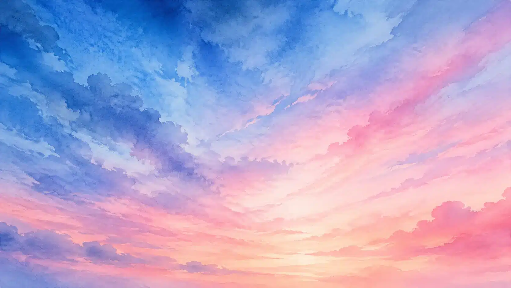
There is something hypnotic about a watercolor sky. One moment, pigment ances softly across wet paper like drifting smoke, and the next moment, the colors settle into glowing clouds, fading horizons, and atmospheric depth that almost feels alive. Unlike acrylic or oil painting, watercolor has a mind of its own. It flows, blooms, spreads, and reacts to every drop of water. That unpredictability is exactly what makes watercolor skies so beautiful. A perfect sky does not look stiff or overworked. It breathes.
Many beginners think painting skies is easy because skies seem simple from a distance. Just blue paint and clouds, right? Then the brush touches paper, and suddenly harsh edges appear, muddy colors form, and unwanted blooms spread everywhere. Watercolor skies expose every weakness in water control. At the same time, they reward patience and observation more than almost any other subject in painting.
Professional watercolor artists consistently emphasize that mastering skies improves every other painting skill. Wet-on-wet blending, soft transitions, layering, lifting, edge control, and timing all come together in a single sky study. According to watercolor instructors and artist tutorials published recently, understanding moisture levels on paper is one of the biggest keys to achieving natural watercolor skies.
This guide walks through every essential technique needed to paint expressive watercolor skies that feel luminous, natural, and full of atmosphere.
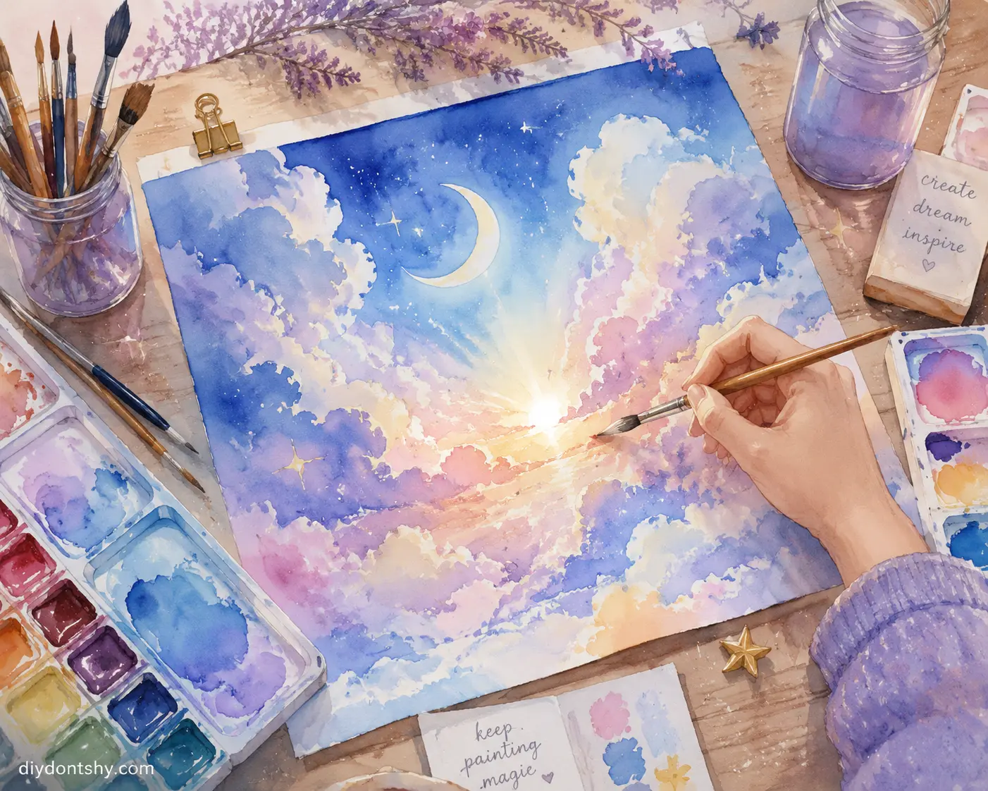
Contents
Why Watercolor Skies Feel So Magical
A watercolor sky is never just a background. It controls the mood of the entire painting. A pale morning sky can make a landscape feel hopeful and fresh, while a dramatic storm sky can create tension and mystery before the viewer even notices the foreground details. The sky becomes emotional storytelling.
What makes watercolor particularly powerful for skies is its transparency. Light passes through the pigment and reflects back through the white paper underneath. That glow is difficult to recreate in other mediums. Wet-on-wet watercolor techniques allow pigments to blend naturally without visible brush marks, creating softness that resembles real clouds and shifting air. Recent watercolor studies and artist tutorials explain that the spontaneous movement of pigment in water is what gives skies their atmospheric quality.
Watercolor skies also force artists to loosen control. Beginners often try to “fix” every shape as the paint moves. Ironically, that usually creates muddy, lifeless skies. The magic happens when you guide the paint rather than dominate it. Think of watercolor like jazz music instead of classical music. There is structure, but there is also improvisation.
Many experienced painters compare watercolor skies to weather itself. You cannot completely control the wind, but you can learn how it behaves. Once you understand moisture, pigment density, and drying stages, watercolor stops feeling random and starts feeling collaborative.
Essential Supplies for Painting Realistic Watercolor Skies
Painting skies successfully starts long before the first brushstroke. Your materials have a major impact on how water and pigment behave on the page. Low-quality paper, worn brushes, or weak pigments can make smooth blends much harder to achieve, even with good technique.
The most important investment is high-quality paper. Many watercolor artists recommend 100% cotton, cold-pressed paper because it absorbs moisture evenly, stays workable longer, and reduces unwanted backruns. A large round or mop brush is ideal for broad sky washes, while a medium round brush is useful for refining cloud edges and adding subtle details.
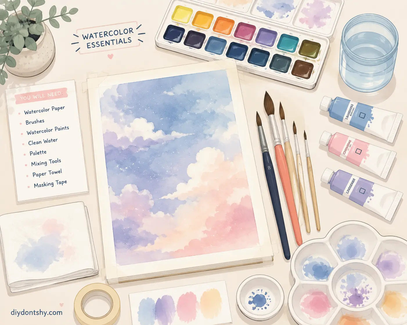
Here are the basic supplies that work well for most watercolor sky studies:
• 100% cotton cold-pressed watercolor paper
• Large mop or round brush for washes
• Medium round brush for details
• Professional-grade watercolor paints
• Two containers of clean water
• Mixing palette
• Paper towels or a soft cloth for lifting color
Color selection is equally important. Instead of using many pigments, choose two or three colors that blend well together. A limited palette produces cleaner transitions, more harmonious skies, and makes it easier to avoid muddy mixtures.
Creating a Smooth Base Wash for the Background
The base wash is the foundation of the entire sky. If the wash is uneven, streaky, or patchy, every layer afterward becomes harder to control. A smooth wash creates the illusion of open atmosphere before clouds or details are even added.
Start by lightly wetting the paper with clean water using a large brush. The surface should appear evenly glossy, not flooded with puddles. One of the biggest mistakes beginners make is soaking the paper excessively. Professional watercolor instructors explain that overly wet paper causes uncontrolled blooms and pigment drift. The goal is controlled moisture, not chaos.
When applying the first wash, work quickly and confidently. Hesitation creates drying lines. Tilt the paper slightly if needed so gravity helps move the pigment downward smoothly. Imagine ironing wrinkles out of fabric. Your brush should glide continuously across the page rather than scrubbing back and forth.
A smooth sky wash often uses graduated color transitions. For example, a blue sky usually becomes lighter toward the horizon. To create that effect, load stronger pigment at the top and gradually dilute it with water as you move downward. Watercolor naturally fades while drying, so many artists intentionally paint slightly darker than the intended final result.
Timing is everything during this phase. Once sections begin drying, avoid reworking them excessively. Watercolor rewards decisiveness. Overworking is like stirring soup too long; it eventually loses clarity and freshness.
Choosing Color Palettes for Different Sky Moods
Color determines emotional temperature. A sunrise sky feels entirely different from a midday sky, even if the cloud structure is similar. Choosing the right palette transforms a technically correct painting into an emotionally convincing one.
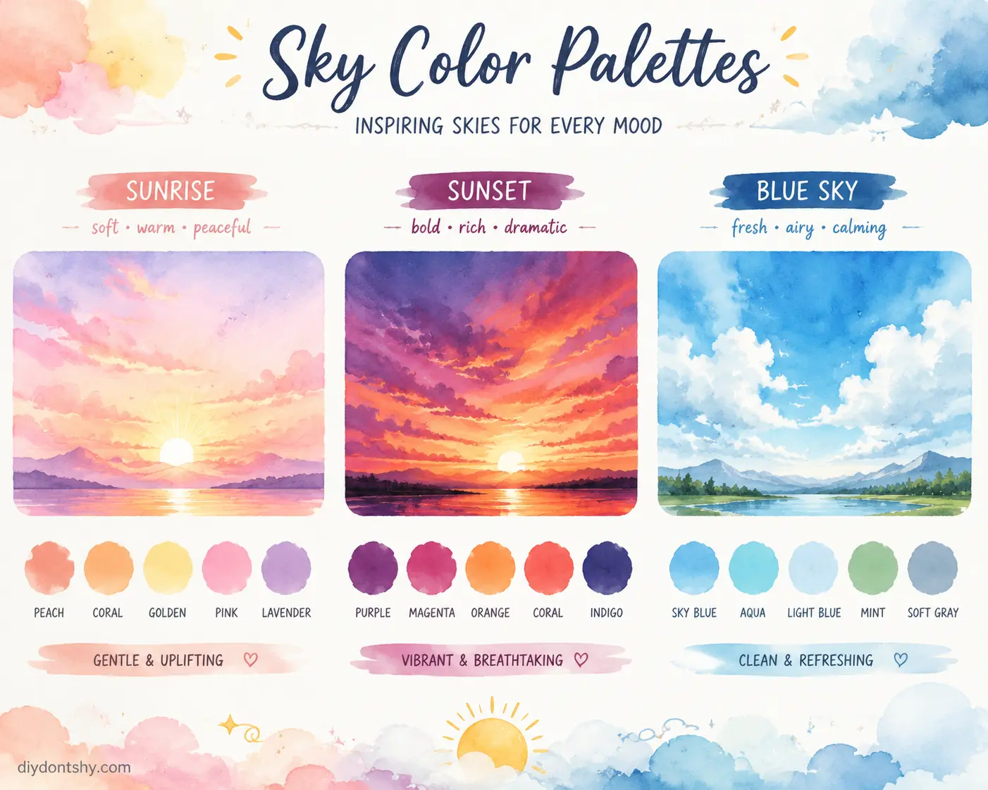
Sunrise Color Combinations That Glow
Sunrise skies usually contain softer transitions and cooler warmth compared to sunsets. Gentle yellows, diluted peach tones, pale pinks, and lavender shadows work beautifully together. The key is restraint. Sunrise colors should feel like light slowly waking up rather than exploding dramatically.
A common beginner mistake is making sunrise colors too saturated. Real morning skies often have a misty softness because the atmosphere diffuses light gently. Wet-on-wet blending helps create this hazy transition naturally.
Sunset Palettes With Warm Drama
Sunsets invite bolder contrast and richer saturation. Warm oranges, deep crimson reds, burnt sienna, violet, and indigo often combine to create powerful evening skies. The challenge is preventing mud. Complementary colors can quickly neutralize each other if overmixed.
Professional watercolor artists often recommend allowing colors to mingle directly on wet paper instead of premixing everything heavily on the palette. This creates cleaner transitions and more vibrant energy.
Fresh and Clean Colors for Blue Skies
Clear daytime skies seem simple but require careful temperature variation. A flat blue wash looks artificial. Natural skies shift between warm and cool blues depending on altitude, humidity, and sunlight.
A useful approach is layering ultramarine with cerulean or cobalt blue. Slight touches of warm gray near cloud shadows add realism. Tiny temperature shifts make skies feel believable without overwhelming the simplicity.
Blending Wet-on-Wet Without Harsh Edges
Wet-on-wet blending is the soul of watercolor sky painting. It creates those dreamy gradients and soft cloud edges that make watercolor feel atmospheric instead of graphic.
The phrase “wet-on-wet” simply means applying wet paint onto already wet paper. The moisture allows pigments to spread naturally and merge softly together. Artists consistently describe this technique as essential for realistic skies and atmospheric effects.
The real challenge lies in understanding paper moisture stages. According to experienced watercolor painters, paper moves through several wetness states:
- Soaked
- Shiny
- Satin
- Moist
- Damp
- Dry
Many artists consider the satin stage ideal for controlled wet-on-wet blending because pigment spreads gently without becoming uncontrollable.
Think of watercolor paper like soil after rain. Completely flooded ground creates puddles, while slightly damp earth absorbs water gracefully. The same principle applies to watercolor blending.
To avoid harsh edges:
- Keep a consistent moisture level across the painting area
- Use larger brushes for broad transitions
- Avoid stopping midway through a wash
- Reload pigment quickly before sections dry
- Soften edges immediately with a damp clean brush
Artists discussing beginner watercolor skies frequently point out that hard edges usually appear because the paper dried faster than expected or because the brush carried too little moisture.
Cloud Techniques That Add Depth and Atmosphere
Clouds are where personality enters the sky. They create movement, depth, and scale. A sky without cloud variation can feel flat, while thoughtfully designed clouds make the painting breathe.
One of the easiest methods for soft clouds involves tissue lifting. While the wash is still damp, gently press a tissue into selected areas to lift pigment. This creates soft-edged cloud shapes with natural irregularity. Because clouds rarely have perfectly defined edges, randomness actually improves realism.
For dramatic storm clouds, layering becomes essential. Start with soft wet-on-wet forms, allow them to dry partially, then glaze darker shadow shapes underneath. Atmospheric skies depend heavily on value contrast rather than detail. Many watercolor instructors emphasize using a full range of values; from bright whites to deep darks; to create convincing skies.
Clouds also require edge variation. Real clouds contain both sharp and soft transitions depending on light direction and moisture. Some edges dissolve into the sky while others appear crisp against sunlight. Mixing wet-on-wet and wet-on-dry techniques in the same painting creates this natural complexity.
A useful mental trick is imagining clouds as mountains of vapor. They have structure, weight, and form. Painting them becomes easier when you stop thinking of them as flat white blobs.
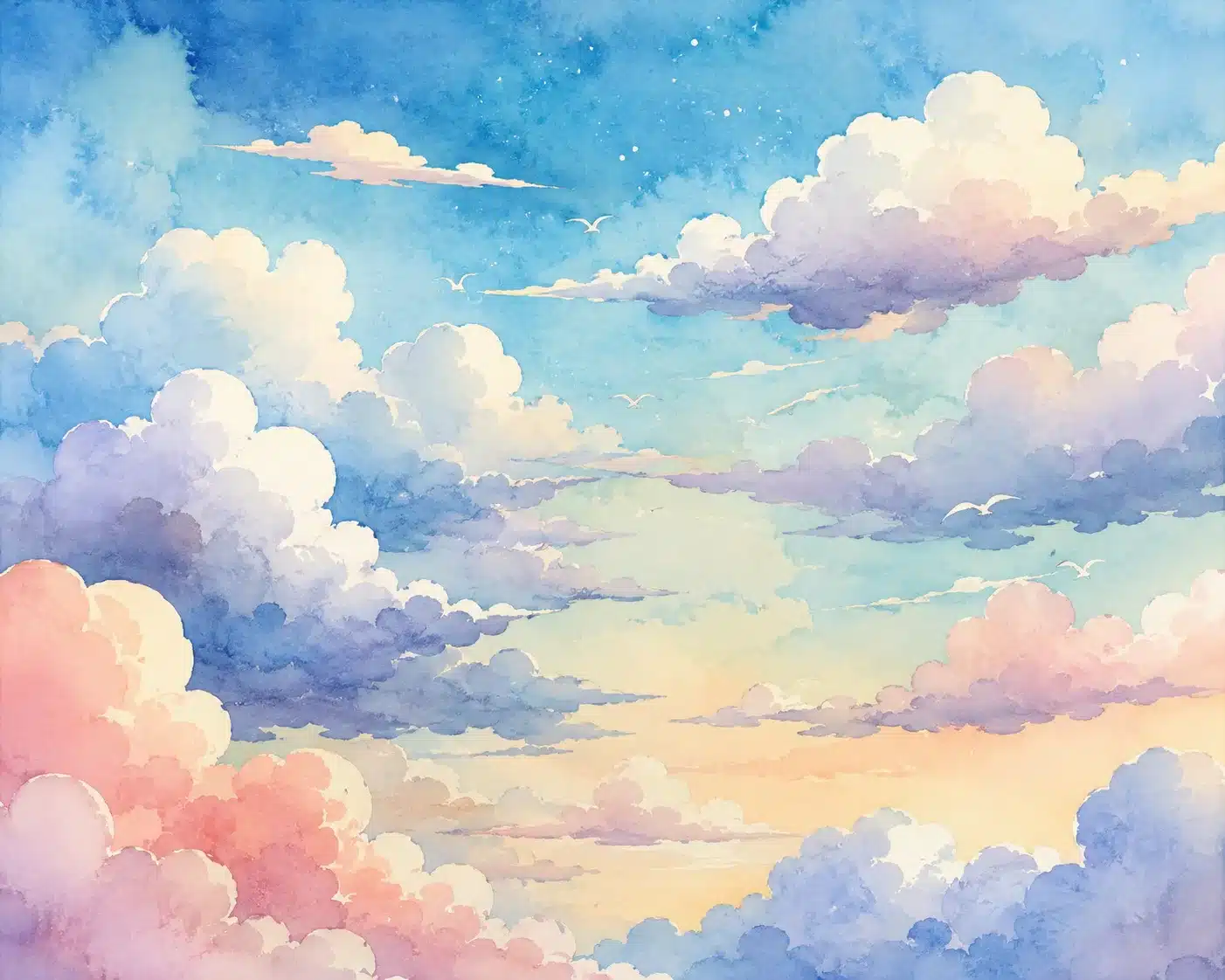
Using Water Control to Prevent Backruns and Stains
Nothing frustrates watercolor painters more than accidental backruns. These strange cauliflower-like blooms appear when excess water pushes pigment outward into drying areas. Sometimes blooms can look beautiful and expressive. Other times they ruin smooth skies completely.
Scientific studies on watercolor behavior explain that these stains occur because water naturally moves from wetter areas toward drier areas through paper fibers. In simple terms, watercolor follows moisture like rivers following gravity.
Water control is less about perfection and more about balance. Your brush should not carry dramatically more water than the paper surface. If your brush is overloaded, blooms become likely.
Here are common causes of unwanted backruns:
| Problem | Result |
|---|---|
| Adding wet paint to semi-dry paper | Cauliflower blooms |
| Uneven paper moisture | Patchy drying |
| Excessive puddles | Harsh stains |
| Overworking washes | Muddy texture |
| Low-quality paper | Poor absorption |
Professional watercolor artists often dab their brush lightly on a cloth before touching the paper to control moisture levels. This tiny habit dramatically improves consistency.
Interestingly, some artists intentionally use blooms for atmospheric skies because they mimic natural cloud diffusion. Watercolor is unique because even “mistakes” can become expressive tools.
Building Layers for Natural Color Variation
Flat skies feel lifeless. Nature contains endless subtle shifts in color temperature, humidity, and atmospheric density. Layering helps recreate that complexity.
Watercolor layering is usually called glazing. A transparent layer of color is applied over a completely dry previous layer. This allows artists to deepen color gradually without losing luminosity.
The secret is patience. Beginners often rush layering before the paper fully dries, causing muddy mixtures instead of transparent depth. Each glaze should feel intentional and light.
For example, a sunset sky may begin with a pale yellow wash, followed by transparent orange glazes, then subtle violet shadows layered afterward. Because watercolor remains transparent, underlying colors continue glowing through later layers.
Many successful watercolor skies combine both spontaneous wet-on-wet passages and carefully controlled glazing. The contrast between loose blending and structured layering creates visual richness.
Layering also helps correct weak initial washes. If a sky dries too pale, additional transparent glazes can rebuild depth gradually instead of forcing heavy pigment immediately.
Lifting and Softening Areas for Light Effects
Light is what makes watercolor skies feel alive. One of watercolor’s greatest strengths is the ability to preserve or recover highlights through lifting techniques.
Lifting simply means removing pigment from the paper. A damp brush, sponge, or tissue can gently pull color away to create glowing light effects. This technique works especially well for cloud highlights, distant haze, or sunlight breaking through storm clouds.
Timing matters enormously. Fresh paint lifts easily, while fully dried staining pigments become harder to remove. Some artists purposely choose non-staining colors for skies because they remain more flexible during lifting.
Softening edges is equally important. Hard cloud outlines often make skies look cartoonish. Using a clean damp brush to feather edges creates atmospheric transitions that resemble real vapor dispersing into air.
Think about how clouds behave in real life. Their edges are rarely static. Wind, humidity, and light constantly reshape them. Softening techniques help capture that movement naturally.
Many advanced watercolor painters use lifting almost like sculpting. Instead of only adding pigment, they carve light back out of the painting.
Small Details That Bring the Entire Sky Together
Tiny finishing touches often determine whether a sky feels believable or unfinished. Subtle details create rhythm and realism without overwhelming the softness of watercolor.
A few carefully placed darker cloud undersides can dramatically increase depth. Gentle dry-brush texture near horizon lines can suggest distant atmosphere. Slight color temperature shifts between upper and lower sky areas help imply changing light conditions.
One powerful trick is preserving lost edges. Not every cloud should stand apart distinctly. Allowing certain forms to blend partially into the background creates a natural atmospheric perspective.
Another important detail is restraint. Beginners often keep adding more clouds, more contrast, and more texture until the sky becomes cluttered. Realistic skies usually contain large quiet areas that allow focal points to breathe.
Online watercolor communities frequently encourage beginners to embrace experimentation because watercolor skies improve through repetition and observation rather than rigid formulas. Every sky behaves slightly differently depending on humidity, paper quality, pigment type, and timing.
That unpredictability is not a flaw. It is the heartbeat of watercolor itself.
Conclusion
Painting watercolor skies is really about learning the language of water. Every wash, bloom, gradient, and soft cloud edge comes from understanding how moisture and pigment interact on paper. Once you stop fighting watercolor and start guiding it, skies become less intimidating and far more expressive.
Smooth background washes create atmosphere. Thoughtful color palettes establish emotion. Wet-on-wet blending removes harsh transitions. Controlled layering adds richness and realism. Lifting techniques bring light back into the scene. Small finishing details unify the composition without overcomplicating it.
The most beautiful watercolor skies rarely look overplanned. They feel natural, breathable, and slightly unpredictable; just like the sky outside your window. The more you practice observing real clouds, changing light, and atmospheric color shifts, the more convincing your paintings become.
Watercolor rewards patience, courage, and a willingness to let the medium surprise you.
FAQs
1. What is the best paper for painting watercolor skies?
Most artists recommend 100% cotton cold-pressed watercolor paper because it absorbs water evenly and allows smoother blending. Cotton paper also stays wet longer, giving you more time to work wet-on-wet.
2. Why do I keep getting harsh edges in my watercolor sky?
Harsh edges usually happen when sections of paper dry before blending is complete. Working faster, using larger brushes, and maintaining consistent moisture across the paper can help prevent this problem.
3. How do I stop watercolor backruns or blooms?
Backruns occur when excess water flows into semi-dry paint areas. Controlling brush moisture and avoiding puddles are the best ways to reduce unwanted blooms.
4. Which colors work best for sunset skies?
Warm pigments like quinacridone rose, burnt sienna, cadmium orange, and ultramarine blue often create beautiful sunset combinations. Limiting the palette helps avoid muddy mixtures.
5. Can beginners learn wet-on-wet watercolor techniques easily?
Yes, but it takes practice. Many beginners struggle at first because watercolor timing feels unfamiliar. Repeated small studies help develop confidence with moisture control and blending behavior.

Kareem Sallam is an Egyptian special writer based in Australia, with a strong interest in practical ideas and creative content that focuses on everyday solutions. He writes clear, engaging articles designed to be easy to follow and useful for a wide range of readers.
His work centers on DIY projects, handmade ideas, simple crafts, and home based creativity. Kareem aims to deliver content that is practical, inspiring, and accessible, helping readers turn simple materials into smart and enjoyable projects.