How to Paint Realistic Flowers in Acrylic with Depth and Texture
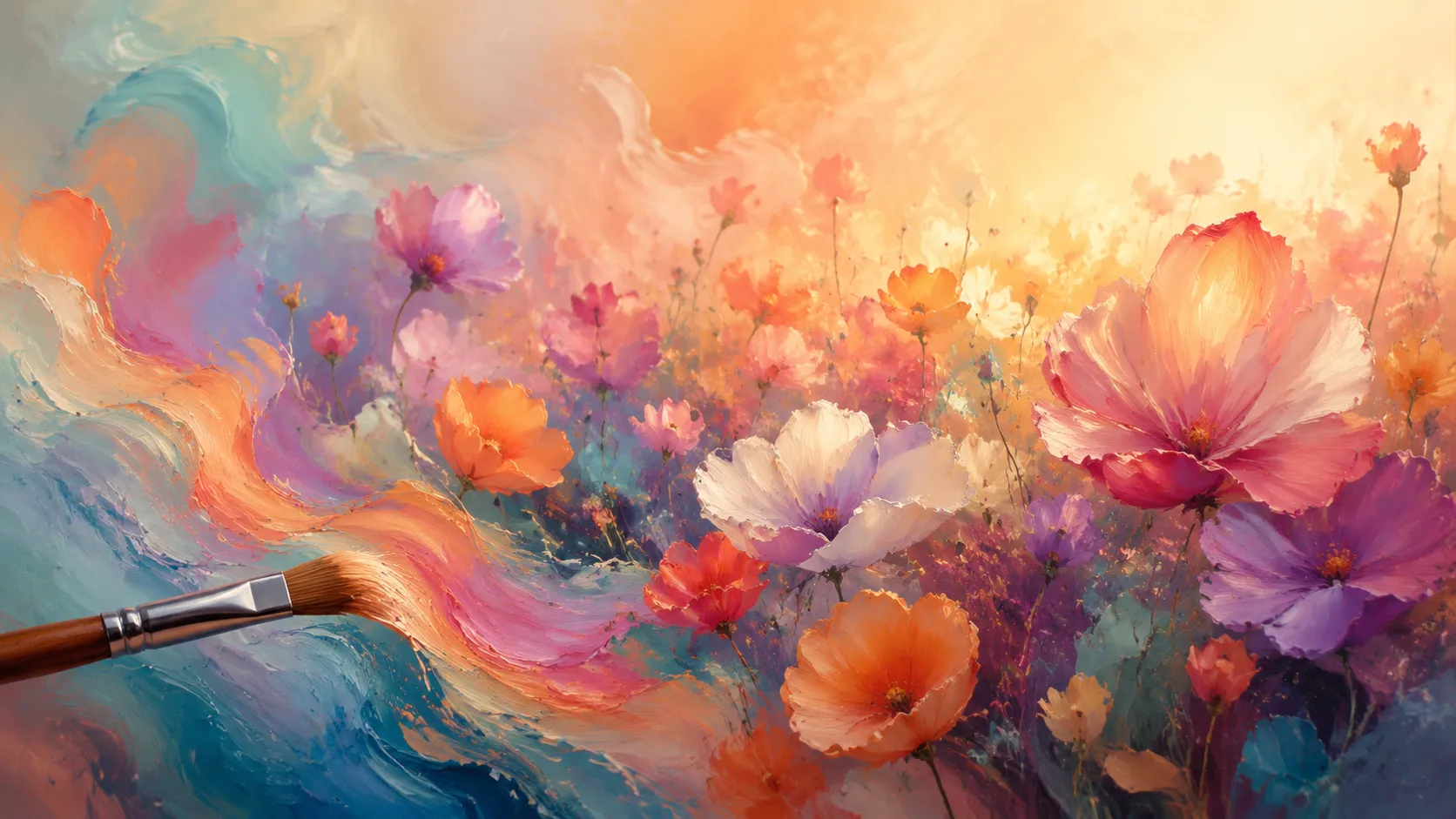
Painting flowers with acrylics can feel a little like trying to catch sunlight in your hands. Flowers are delicate, layered, and constantly shifting in color depending on light, atmosphere, and perspective. One tiny mistake in shading or texture can turn a vibrant bloom into something stiff and artificial. The good news? Acrylic paint is one of the best mediums for creating realistic floral art because it dries quickly, layers beautifully, and allows incredible control over details and textures. Recent painting guides and artist tutorials published in 2026 continue to highlight acrylic layering, glazing, and color blending as the most effective methods for achieving lifelike flower paintings.
Professional floral artists often say realistic flower painting is less about painting petals and more about painting light, depth, and softness. Think of each flower like a tiny sculpture made from color and shadow. Every petal curves differently. Every edge catches light in its own unique way. Once you understand how those elements work together, your paintings begin to breathe naturally instead of looking flat or decorative.
Before jumping into the painting process, it helps to understand the structure behind realism. You need strong reference photos, a thoughtful color palette, controlled brushwork, and patience with layering. These are the building blocks that separate beginner floral paintings from artwork that truly feels alive. In this guide, you’ll learn how to choose references, mix convincing colors, create soft textures, and avoid the most common mistakes artists make when painting flowers with acrylics.
Contents
Understanding What Makes Floral Paintings Look Realistic
Realism in flower painting is not about copying every tiny detail perfectly. That surprises many beginners. A flower can contain hundreds of subtle color shifts and textures, yet the human eye only notices a few critical visual clues. When artists capture those clues correctly, the brain fills in the rest automatically. That’s why some paintings feel photorealistic even though they use loose brushstrokes.
One of the biggest secrets is observation. Most artists paint what they think a flower looks like instead of what they actually see. A white rose, for example, is rarely truly white. It contains pale blues, warm creams, soft violets, and cool shadows. The petals overlap in unpredictable ways, creating tiny valleys of darkness and ridges of reflected light. When you begin seeing flowers as forms instead of symbols, your paintings immediately improve.
Professional acrylic artists frequently focus on value relationships before color. According to recent acrylic painting tutorials published in 2026, mastering light and dark contrast produces stronger realism than obsessing over intricate details. That means your first goal should be understanding where the light hits and where shadows naturally form.
Think of flower painting like sculpting with color. Each layer adds dimension, softness, and movement. Acrylics are particularly effective for this because they allow repeated glazing and layering without long drying times. Instead of forcing realism in one thick coat of paint, you slowly build it piece by piece. That gradual process creates the depth and luminosity that realistic floral art is known for.
Choosing Reference Photos That Capture Natural Flower Details
A strong reference photo is like having a great roadmap before a long journey. Without one, even experienced painters struggle to create believable flowers. The quality of your reference directly affects the realism of your final painting, which is why choosing the right image matters so much.
Look for photos with clear lighting and visible petal structure. Blurry references or heavily filtered images hide important details you’ll need later. The best flower references show distinct light direction, crisp shadows, and enough contrast to reveal the form of each petal. Natural sunlight often works better than studio lighting because it creates softer transitions and realistic color variation.
Recent acrylic flower tutorials emphasize the importance of reference images with visible value contrast and layered petals. Flowers photographed in flat lighting often look lifeless because there are no dramatic shifts between light and shadow. A flower illuminated from one side usually creates more visual interest and dimensionality.
Here are a few characteristics of excellent flower references:
| Feature | Why It Matters |
|---|---|
| Strong directional light | Creates realistic depth |
| Sharp focus | Reveals texture and edges |
| Natural color variation | Helps avoid flat painting |
| Visible shadow areas | Defines petal structure |
| Minimal filters | Preserves true colors |
Avoid choosing references simply because the flower looks pretty. A beautiful image does not always translate into a successful painting. Sometimes the most dramatic and realistic paintings come from references with strong shadows, unusual angles, or partially hidden petals. Those imperfections create authenticity.
Another useful strategy is taking your own flower photographs. When you photograph flowers yourself, you control lighting, composition, and focus. Morning and late afternoon light are especially effective because they create soft shadows and glowing highlights that acrylic paint captures beautifully.
Essential Acrylic Supplies for Realistic Flower Painting
Many beginners believe realistic paintings require expensive materials, but that isn’t entirely true. Technique matters far more than price. Still, the right supplies make the process smoother and give you better control over details and blending.
Brush selection plays a massive role in realistic floral painting. Flat brushes help establish larger petal shapes and backgrounds, while round brushes create curved organic strokes. Detail brushes are essential for veins, tiny highlights, and delicate edges. According to current acrylic painting guides, most floral artists rely heavily on a combination of round detail brushes and soft filbert brushes because they mimic the curved nature of petals.
Paint consistency also matters. Heavy-body acrylics offer rich pigment and texture, while fluid acrylics are excellent for glazing and soft transitions. Many professionals combine both types during the same painting. A thick layer establishes structure, and thin transparent layers create luminosity and softness.
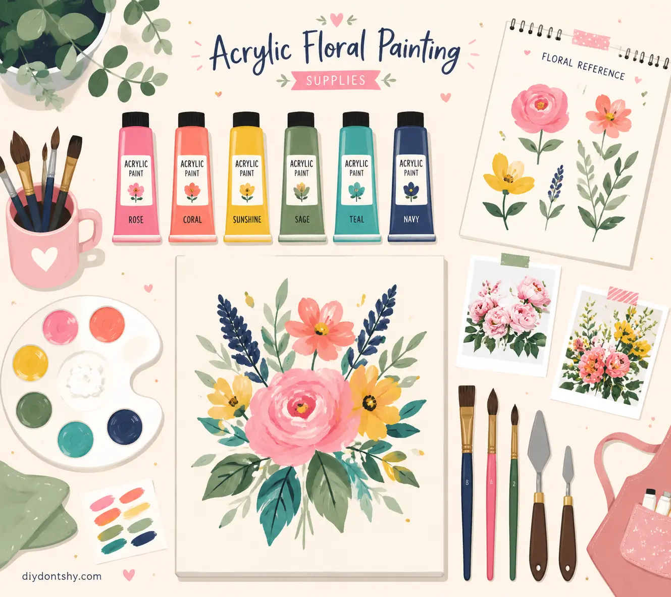
Acrylic mediums are often overlooked but incredibly valuable. Retarder medium slows drying time, making blending easier. Glazing medium helps create transparent layers without weakening pigment. Recent tutorials published in 2026 continue recommending glazing and retarder mediums for flower realism because acrylic paint naturally dries very fast.
Here’s a simple setup for realistic floral painting:
| Supply | Purpose |
|---|---|
| Round detail brush | Fine lines and veins |
| Filbert brush | Soft petal blending |
| Heavy-body acrylics | Rich opaque layers |
| Glazing medium | Transparent depth |
| Retarder medium | Longer blending time |
| Canvas panel | Smooth painting surface |
The surface you paint on matters too. Smooth canvases or gessoed panels allow finer detail work than rough textured canvases. Since flower realism depends heavily on soft transitions and crisp edges, smoother surfaces usually produce better results.
Building Depth with the Right Acrylic Color Palette
Color is where many floral paintings either succeed beautifully or collapse completely. Flowers rarely consist of one simple color. A red rose may contain hints of magenta, orange, burgundy, violet, and even green reflections from surrounding leaves. Realistic flower painting depends on understanding these subtle relationships.
One of the best approaches is using a split primary palette. Recent professional flower painting tutorials strongly recommend this method because it expands color mixing possibilities while maintaining natural vibrancy. A split primary palette includes warm and cool versions of each primary color, allowing more realistic mixing.
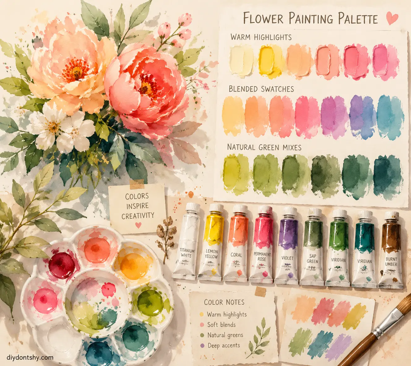
For example:
| Warm Colors | Cool Colors |
|---|---|
| Cadmium Red | Quinacridone Magenta |
| Cadmium Yellow | Lemon Yellow |
| Ultramarine Blue | Phthalo Blue |
Warm colors create glowing highlights and sunlit petals, while cool colors create depth and atmospheric shadows. Combining both gives flowers a natural appearance instead of a cartoon-like look.
Green mixing is another major factor. Straight tube greens often appear artificial and overly saturated. Experienced artists mix their own greens using yellows, blues, browns, and reds to create earthy natural foliage. Acrylic painting experts repeatedly recommend custom green mixing for realistic floral compositions.
Think of color like music. If every note is loud and bright, the song becomes exhausting. Realistic paintings need quiet tones alongside vibrant accents. Neutral colors help bright petals stand out more dramatically.
One useful habit is creating color swatches before painting. Test shadow mixtures, highlight tones, and transitional colors beforehand. This saves enormous frustration later and helps maintain harmony across the entire painting.
The Role of Light and Shadow in Realistic Petals
Light is the heartbeat of realism. Without convincing light and shadow, flowers instantly look flat no matter how detailed they are. Acrylic artists often spend more time studying values than painting actual details because value structure determines whether the flower feels dimensional.
Every petal acts like a tiny curved surface catching light differently. Some petals face directly toward the light source while others fold inward, creating deep shadow pockets. Observing these relationships carefully transforms your painting from decorative to believable.
Many recent floral painting tutorials emphasize value contrast as the foundation of realism. Strong contrast near focal points naturally attracts the viewer’s eye. That means the brightest highlights and darkest shadows should usually appear near the center of interest.
A common beginner mistake is making shadows too black or muddy. Real shadows still contain color. A pink petal shadow might contain cool purples or muted magentas rather than gray or black. Colored shadows feel much more alive.
Translucency is another critical feature. Flower petals often allow light to pass through them, especially near edges. You can create this effect using thin acrylic glazes layered gradually over lighter underpainting. This technique creates glowing petals that appear illuminated from within.
Recent acrylic realism tutorials recommend building translucent effects slowly with multiple thin coats instead of one thick opaque layer. That gradual buildup mimics the natural softness of real petals remarkably well.
Layering Techniques That Create Soft Blended Textures
Layering is where acrylic painting truly shines. Unlike watercolor or oil paint, acrylics allow rapid layering without waiting days for drying. This makes them ideal for building realistic flower textures step by step.
Most professional floral paintings rely on multiple translucent layers rather than thick paint applied all at once. Each layer subtly adjusts color, value, and texture until the flower gains believable depth. It’s similar to building fabric folds slowly instead of carving everything instantly.
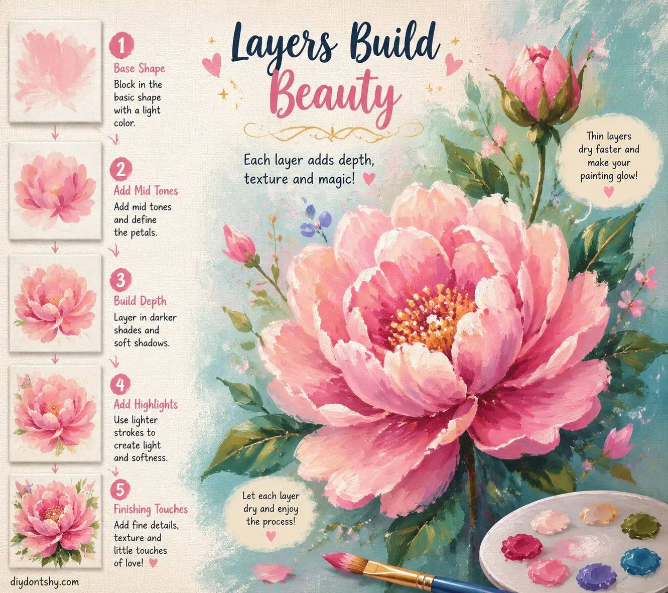
One of the most effective methods is glazing. A glaze is a transparent layer of paint mixed with medium. Artists use glazes to soften transitions, enrich shadows, and create luminous petals. Acrylic painting resources published recently continue highlighting glazing as one of the most important realism techniques.
Wet-on-wet blending is another valuable approach, especially for soft petals like roses or peonies. Since acrylic dries quickly, many artists use retarder medium to extend blending time. This allows smooth transitions between highlights and shadows before the paint sets.
Dry layering works differently. Instead of blending wet paint together, artists apply separate dry layers gradually. This method offers greater control and cleaner edges, making it ideal for detailed flower centers and crisp petals.
Here’s a quick comparison:
| Technique | Best For |
|---|---|
| Wet-on-wet blending | Soft petals and transitions |
| Dry layering | Sharp detail control |
| Glazing | Luminosity and depth |
| Scumbling | Texture and softness |
Soft textures often emerge from patience rather than complexity. Thin layers create visual richness because light passes through them differently. Thick paint can sometimes appear heavy and artificial unless used intentionally for texture.
Brush Control Tips for Delicate Edges and Fine Details
Brush control separates polished floral paintings from rough beginner work. Flowers contain delicate curves, thin veins, and fragile transitions that require precise handling. Even the best color palette cannot compensate for uncontrolled brushwork.
Pressure control is essential. Pressing too hard creates stiff, clumsy edges. Light pressure creates graceful tapering strokes that mimic natural petal shapes. Many artists hold brushes farther back for softer movement and closer to the bristles for detailed control.
Stroke direction matters too. Petal strokes should usually follow the natural growth direction of the flower. This subtle detail creates believable structure and movement. Random brushstrokes can unintentionally flatten the form.
Recent acrylic flower tutorials strongly emphasize soft edges combined with selective sharp details. Real flowers rarely contain uniformly sharp outlines. Some edges dissolve softly into shadow while others catch strong light. Varying edge quality creates realism.
Tiny highlights and petal veins should be used carefully. Overloading flowers with detail can actually reduce realism. Think of detail like seasoning in cooking. Too much overwhelms the painting.
One effective technique involves layering fine details near the end rather than early in the process. This keeps the painting loose and dimensional instead of overworked.
Common Mistakes That Make Flowers Look Flat
Almost every artist encounters the same realism problems while learning floral painting. The encouraging part is that these mistakes are fixable once you recognize them.
One major issue is overblending. Beginners often blend every transition until the painting loses structure and contrast. Real flowers contain clear value changes alongside soft gradients. If everything becomes equally soft, the flower looks blurry and flat.
Another common problem is using colors directly from the tube without modification. Pure unmixed colors often appear artificial because nature contains subtle complexity. Mixing muted tones and secondary variations creates more convincing realism.
Ignoring background contrast also weakens paintings dramatically. A flower can lose impact if the background shares identical values and saturation. Strong focal flowers usually stand out through contrast in color, texture, or lighting.
Here are some common realism killers:
| Mistake | Result |
|---|---|
| Overblending | Loss of structure |
| Pure tube colors | Artificial appearance |
| Weak shadows | Flat petals |
| Uniform edges | Stiff unrealistic shapes |
| Too many details everywhere | No focal point |
According to acrylic painting experts, painting from dark to light helps maintain depth more effectively than jumping randomly between tones. Building values progressively preserves dimensionality and prevents muddy color mixtures.
Patience is often the hidden solution. Realistic paintings evolve gradually. Trying to finish flowers too quickly usually leads to stiff brushwork and weak layering.
Bringing Leaves and Backgrounds into Balance
Flowers may be the stars of the painting, but leaves and backgrounds act like supporting actors. When handled properly, they enhance realism and direct attention toward the focal bloom. When handled poorly, they compete for attention and create visual chaos.
One of the smartest compositional strategies is reducing detail in secondary areas. Leaves do not need the same precision as focal petals. Softer edges and muted colors help push them into the background naturally.
Recent flower painting guides encourage mixing custom greens instead of relying on bright premixed greens because natural foliage contains enormous color variation. Adding touches of red, blue, or brown creates richer, earthier foliage.
Backgrounds should support the flower emotionally and visually. Dark backgrounds create drama and contrast, while light backgrounds create softness and airiness. Some artists intentionally blur backgrounds slightly to mimic shallow depth of field photography.
Think of backgrounds like stage lighting in theater. Their job is to help the main subject shine, not steal attention. Subtle texture and color transitions often work better than detailed scenery.
Balancing leaves also means varying shape and direction. Repetitive leaf placement can make the painting feel mechanical. Natural arrangements appear slightly irregular and organic.
Final Touches That Make Floral Paintings Feel Lifelike
The final stage of a painting is often where realism truly emerges. Tiny adjustments in highlights, edges, and texture can suddenly make the entire piece feel alive.
Selective highlights are especially powerful. Adding crisp highlights only where the strongest light hits creates sparkle and dimensionality. Too many highlights flatten the effect because nothing stands out anymore.
Texture also matters. Some petals are velvety, others glossy, others translucent. You can suggest these textures using varied brushwork and glazing techniques. Recent artist discussions and tutorials frequently highlight layered texture and glazing as key realism tools in acrylic painting.
Stepping back from the painting regularly is incredibly important. Details that look correct up close may appear overwhelming from a distance. Viewing the work in a mirror can also reveal balance problems instantly.
One trick many professionals use is leaving small imperfections. Real flowers are not perfectly symmetrical. Slight irregularities make paintings feel natural and organic rather than digitally perfect.
The final varnish can dramatically enhance acrylic flower paintings too. Satin or gloss varnish deepens color richness and unifies surface texture, helping layered glazes appear more luminous.
Conclusion
Learning how to paint realistic flowers in acrylic is less about copying nature perfectly and more about understanding how nature behaves. Flowers are built from layers of light, subtle color shifts, soft edges, and delicate textures. Once you learn to observe those qualities carefully, realism becomes much more achievable.
The journey starts with strong reference photos and thoughtful color choices. From there, controlled layering, strategic shadows, and patient brushwork gradually transform simple shapes into believable blooms. Acrylic paint gives artists enormous flexibility because it supports glazing, blending, texture building, and rapid corrections all within the same medium.
Realistic flower painting rewards patience more than speed. Every transparent glaze, softened edge, and carefully placed highlight contributes to the illusion of life. Over time, you stop painting individual petals and begin painting atmosphere, movement, and emotion.
The most successful floral paintings feel alive because they capture more than appearance. They capture fragility, light, and natural rhythm. That’s the true magic of acrylic flower realism.
FAQs
1. What is the best acrylic paint for realistic flower painting?
Heavy-body acrylics are usually best because they offer strong pigmentation and excellent layering control. Many artists combine heavy-body paints with fluid acrylics for glazing and soft blending effects.
2. How do I make acrylic flower petals look soft?
Use thin glazes, soft brushes, and gradual blending techniques. Avoid harsh outlines everywhere. Combining wet-on-wet blending with transparent glazing creates the most natural softness.
3. Why do my painted flowers look flat?
Flat flowers usually result from weak value contrast, insufficient shadows, or overblending. Strong highlights and darker shadow areas create dimensionality and depth.
4. What colors should I avoid using directly from the tube?
Bright premixed greens are often too artificial for realistic foliage. Mixing your own greens using blues, yellows, browns, and reds produces more natural results.
5. Is acrylic paint good for realistic floral art?
Yes, acrylic paint is excellent for floral realism because it dries quickly, layers easily, and supports techniques like glazing, blending, scumbling, and texturing.

Kareem Sallam is an Egyptian special writer based in Australia, with a strong interest in practical ideas and creative content that focuses on everyday solutions. He writes clear, engaging articles designed to be easy to follow and useful for a wide range of readers.
His work centers on DIY projects, handmade ideas, simple crafts, and home based creativity. Kareem aims to deliver content that is practical, inspiring, and accessible, helping readers turn simple materials into smart and enjoyable projects.